Wednesday, April 8, 2015

Exercise 7 - ArcPad Data Collection Part 2

Introduction

This exercise is part 2 of the ArcPad Data Collection exercise. Part 1 of the exercise can be seen here.  The goal of the exercise for our group was to capture points as part of a Micro-Climate survey.  We were to collected data on Wind Speed, Dew Point, Humidity, Windchill, Ground Cover, Temp at Surface, Temp at 2 meters, as well as notes.  We were also supposed to gather data on Wind Direction but most groups, including ours, did not have a compass.  The data from one group that did collect Wind Direction data can be seen in the results section as a smaller map.
Once all the data was collected we joined all  the data together to form a single feature class.  After this we were able to go to town mapping out the data. 


Study Area
Our Study Area was on the University of Wisconsin-Eau Claire campus in Eau Claire, Wisconsin. The campus is located near the center of the city, and is bisected by the Chippewa river.  Figure 1 shows a map of the Eau Claire campusFigure 2 shows the zones that we collected data from.  Our group, consisting of Galen Kiely and Nick Bartelt was given the zone at the top of the map, including the footbridge.

Figure 1.  This map shows the University of Wisconsin - Eau Claire. Most buildings are labeled.  This is actually a map of the wireless coverage on campus, but it gets the job done very well.

Figure 2. This is a screen capture of the aerial imagery used as a background during this project.  It also shows the collections zones outlined in red. Our group was given the zone toward the top of the map going across the foot bridge.


The weather on the day we collected was very nice for early March.  The previous few days had seen temperatures in the upper 40’s rising into the 50’s.  The sun had melted most of the snow cover, but there were still areas that were heavily shaded that had not melted.  There were also several areas around campus that snow had been piled over the course of the winter, and there was still ice on the banks of the Chippewa river. 

As part of our preperation for this exercise we created a Geodatabase with Domains and Subtypes in Exercise 5. This link takes you to the tutorial from Exercise 5.  As part of that we were required to estimate the ranges of data that we would collect.    We estimated the range of possible temperatures at -30F to 60F.  At the time most thought we would be closer to the former than the latter.  As it turned out our group and possibly another group collected at least one sample data point above 60F.

Methods

Following on Exercise 5 and Exercise 6, we began by deploying the geodatabase, this process is covered in the methods section of exercise 6.  When we confirmed successful deployment we headed out to our assigned zone. 

Each group was given a Kestral 3000 Weather Meter.  Simple to operate, the Kestrel 3000 allows for the easy collection of weather data, including the features shown in figure 3. 

Figure 3. Kestrel Weather Meter. These were used to collect data on Humidity, Temperature at Surface, Temperature at two meters, Dew Point, Wind Chill, and Wind Speed during the survey.
Figure 4. This shows the capabilities of the Kestrel unit, as well as some basic operations.  We printed out a copy of these so we could remember what the symbols meant, very useful.


We worked as a team with one person using the Trimble Juno and the other on the Kestrel.  One thing we noted was that it took longer to collect all the data than we had thought it would take.  The Kestrel instructions recommend about 15 seconds for an accurate reading.  Since we were taking two separate temp readings, one at the height of two meters and another at the surface it took about 1.5 minutes to collect each point, including notes.  We also noted that the longer we held the unit near the surface, the more the temperature would change.  This could have many implications for the data, but it should still fit our purposes.

We ended up collecting around 55 points in the time we had.  We began on the south side of the bridge collecting points every few meters. The average wind speed on the bridge was 5.8mph. We then walked along the sidewalk path toward the Water St./ Summit Ave. Bridge, then turned and followed the bike path back under the foot bridge.  We noted that there was a temperature difference of several degrees between the bridge and the path underneath.  Once we came near the HHS building, we turned and went north around the Haas parking lot.  We walked and collected points all around the Haas Fine Arts building.  The average wind speed nearer to the building was less than 3mph, this is partly due to the wind screen provided by the trees along the river.  After completing a route around the Haas building and back to the parking lot and band practice field we headed back across the bridge.  As we headed back across the bridge, we collected a few more points and noted that the temperature over the two hour period had changed by 5 degrees at the surface and 3 degrees at two meters.
Once back in the lab we followed the import procedures from exercise 6 to check the data back in.  After all the groups returned, all the points were joined together using the Append tool.  The Append tool allows multiple data sets to be merged into a single data set.  Now that all the data is merged we can begin interpolating the data and making maps.

Results

For more discussion of the interpolation process, the methods used, and the benefits of the various types of Interpolation, see Exercise 2.  I used the Inverse-Distance Weighting Interpolation method.  This method uses distance as a factor to calculate the influence of each point, with nearer points having more influence than far away points.

The first map, figure 5 shows all the points on a background image of the UWEC campus.  It gives a good idea of the scope of the survey that was done.

Figure 5.  This map contains all the points collected by all the groups displayed over the background image.  I found this map helpful in visualizing the distribution around campus once interpolation layers were added.


Next is a map of Dew Point, figure 6.  Dew Point is the temperature below which water vapor condenses to form Dew.  The pattern seems to show clusters of higher DP along Little Niagara creek that runs between upper and lower campus.

Figure 6. This map displays a IDW Interpolation of the points.  Low, damp areas seemed to have the highest Dew Point readings.


Figure 7 is a map of Wind speed.  The pattern indicates higher wind on Upper campus around the dorms and parking lots, and also along the footbridge and river.  This seems consistent with what would be expected.

Figure 7. This map shows an IDW Interpolation of the Wind Speed data that was collected by the groups.  As would be expected the higher, more open areas show more wind activity.


Figure 8 shows the temperature at a height of two meters.  Pattern shows lower temps in the wooded area along Little Niagara Creek, and near the river.  Many areas of higher temperature can be seen in areas shielded by buildings where wind could be lower, but the sun is still bright.

Figure 8.  This map is an IDW Interpolation of the Temperature at a height of two meters.  Open, paved areas are among the warmest areas. They are not shown, but a couple of points actually exceeded the 60 degree range that was set several weeks before in the geodatabase as part of our prep.


Figure 9 is a map of the difference between the temperature at 2 meters and the temperature at the surface.  The differences range from -9.9 to 2 degrees.  This means that in some areas the surface temp is nearly 10 degrees lower than the temp at 2 meters. This map can be somewhat deceptive in that, if you removed the two highest and lowest points, the variation would be less than 4 degrees.  There are also gaps in the data, since one group didn't collect temperature at meter data.

Figure 9.  This map shows the difference between the surface temp, and the temp at two meters. This was created by adding a field in the table, then using the Field Calculator to calculate the equation and populate it accordingly.


Figure 10 displays the surface temperature minus the wind chill.  Windchill is used as a measure of heat loss lost by a body, but is sometimes referred to as the “feels like” temperature.  The map is fairly similar to the temperature map, but there are patterns that can be seen.

Figure 10.  This map show the Wind Chill subtracted from the Surface Temperature.  It was created using the same method as figure 9.


Figure 11 is a little different from the other maps.  Since only one group collected data on wind direction, this map shows only a small section of the study area.  The MPH is indicated by the size of the symbol, and direction is indicated by the orientation of the symbol.  Since this is not a common feature on maps, it took a little digging to find the options to make it happen. 

Figure 11. This micro-micro climate survey shows the Wind Speed and Wind Direction.  Without compasses, most groups were unable to collect Wind Direction data. One group did, and this is the result.


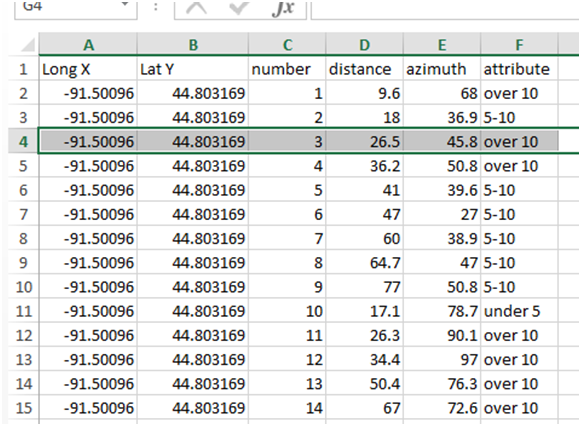
Once I selected out the points that had directions data, opened layer properties.  Under the Symbology tab, I selected Proportional Symbols under the Quantities (see figure 11).  This allows symbols to be relative to the a selected field, in this case Wind Speed.  Next I clicked the rotation button.  This brings up the dialogue on the right side of figure 11.  This allows the rotation of the symbol by a data field, in this case wind_direction.  It also took a little work to get the symbol to work. This symbol is actually used for Dams on maps.  In order to use it as an arrow I clicked on the Min Value button which brings the dialogue in figure 12.  Here I selected the color and size.  I also selected the default angle, 180 degrees from the original position in this case.  So now each symbol shows the wind direction and is proportional to the speed.


Conclusions

The objective was to spend time in the field using the Geodatabase Domains and Subtypes that we created in previous exercises.  This gave us valuable time to gain understanding of what could be done better if there were to be a follow-up exercise, or if we were planning our ow survey at a future job.  We also gained more time on some field equipment, the Trimble Juno, and the Kestrel 3000 Weather Meter.  We succeeded in collecting data in the field, returning it to the lab for import and analysis.  While we have done similar exercises in GIS 1 and Geog 200, I felt this was a much more in-depth process from start to finish; Geodatabase and domain creation to exporting a finished map.


 Sources

UWEC Campus Map: http://www.uwec.edu/LTS/services/coverageMap.htm

 Kestrel Instructions: https://www.forestry-suppliers.com/Documents/133_msds.pdf

Tuesday, April 7, 2015

Azimuth Survey

Introduction

This exercise gave us the chance to learn a new method of field survey. This method is actually very old and requires very little technology.  The method, called Azimuth survey, does just what the name implies.  It uses a fixed location, the distance to a new location, and the direction toward the new location to attain the coordinates of the new location.  You can go as low tech as a compass and measuring tape all the way up to fancy gadgets that use lasers and radio signals to determine the distance and azimuth.  The benefit of learning this technique is that when all the electronics break down, we still have the ability to collect rudimentary points with the minimum of equipment.

For our survey we used the LTI TruPulse laser rangefinder.  The TruPulse is a handheld (but can be tripod mounted) device that sends a laser beam to the target you designate by looking through the eye sight.  The beam bounces back and is measured to give the distance.  This distance is displayed in the eye piece and measures down to .0 meters.  The TruPulse also has a compass built in that allows the user to collect the azimuth of a target in the same manner as the distance. The azimuth is collected in 360.0 degree readings.  This model has several other features that we did not use, including Slope distance, Vertical distance, and Inclination.

Study Area

As part of our preparation for this exercise we were given a demonstration and a brief test period with the TruPulse rangefinder to help familiarize ourselves with the device.  Our test location was the courtyard of Phillips hall on the University of Wisconsin – Eau Claire campus.  This location is an open green space contains several raised garden beds, as well as a few small trees and picnic tables.  Working in two-man teams, each group collected a few points with the device and recorded them on paper.  Once this was complete, we went back to the lab and entered the data into a spreadsheet. This process will be discussed more the methods section. 

As part of our survey we were told to select a location and to collect 100 data points there, as well as some attribute associated with those points.  Our group chose Owen Park as our location with the intention of surveying the location of trees in the park.  We chose this location as it would provide a good line of sight between the start point and the target points.  We decided to use tree height in meters as our attribute and chose to use three categories to be estimated for each tree point: “under 5”, “5-10”, and “over 10”. 

One thing not mentioned yet is the importance of the start point.  The data we are collecting is implicit data, meaning that each point is relative to the point of origin.  There are a few ways to collect the start point.  A GPS unit can be used to collect a point, or using some georeferenced aerial or satellite imagery to pinpoint the location.  We chose the latter; which for the first point was the inside corner of the sidewalk on the east side of first avenue, and the second point we visually aligned ourselves with the south edge of the sidewalk on Niagara st as our X axis and the same sidewalk on 1st Ave as the Y axis.  These landmarks were easy to find later.  We also opted to use a tablet computer to enter our data directly into a spreadsheet, this was a little clunky, but in the end it saved a good bit of time.


Methods
                Preparation list:
(low tech) Compass, measuring rope, notebook and pencil.
(high tech)  Rangefinder, GPS, tablet computer.
Optional tripod for Rangefinder is a great plus.
Location with desired data.
Clear weather.  (weather should not effect a rangefinder, but it could make you miserable)
Data fields to collect: Number, Distance, Azimuth, Attribute.  Start point coordinates.

Once you are at your location you must pick you start point.  It is important to move as little as possible once you have begun collecting data, since each point is collected from the start, and if the start keeps moving you will have a lot more error.  Make notes of your start location if you do not have a GPS, it is crucial to have your start point as accurate as possible.
If using a rangefinder, sight up your target and hit the collect button.  When you have your distance and azimuth recorded sight of the next target.  Once you have the desired number of points you are finished in the field.

Once in the lab you need to enter the data to a spreadsheet if it is not already.  Here is where you will need to add you start locations.  In your spreadsheet select a new column for your longitude (X) and another for your Latitude (Y).  Enter your coordinates in the cell then drag down the corner to populate all the cells in that column that used that start point.  If you did not have a GPS unit to find your start coordinates, you will need to use an online source like Google Earth, or any of the others.  Be warned that Google Earth uses Degree Minutes and seconds, you will need to convert this to decimal degrees before you import.  There are many online converters available.  If you do not convert to decimal degrees, your data may end up in the next county, as ours did.  Another thing to keep in mind is that when moving west of the prime meridian, the number become negative, otherwise your point will end up on the opposite side of the world. Your table should look like table 1.
 
Table 1.  This table is a sample of our data that we collected.  It shows the corrected X and Y coordinates, point number, distance, azimuth, and a specific attribute.  In our case we collected trees and estimated their height in meters divided into three categories: Under 5m, 5-10m, and over 10m.
You will need to have a geodatabase ready to go for your project at this point.  Once you have your data you will need to import it into your geodatabase, you cannot just add it to your geodatabase.  Trust me, if you don’t import it, you will spend many hours failing at the next steps.

To import the spreadsheet, right click on the geodatabase>import>table(single) as seen in figure 1.  This opens up the dialogue seen in figure 2.  You want to click the folder on the right of the input rows, this will take you to the next window where you select the table you want, then select the proper sheet.  Then you will need to name your import output.


Figure 1. Showing the right-click menu path to import a single table into your Geodatabase.  This one simple trick will save you hours in the lab.  But really, you can't run the next tools if you don't import the data. Figure 2 shows the next steps.
Figure 2. This is the dialogue box that opens from the menu shown in figure 1.  Just select your spreadsheet as the input, then designate the location you want the output saved in, and press OK.  This will allow you to run the required tools on the table.


Once the table is imported you will add the data to ArcMap. Click the + button in the top tool bar (figure 3).  Since this is not spatial data yet, it will not show up in the Table of Content – Drawing Order list, click the list by sources button.  
Figure 3. This shows the dialogue box used to add data to your .mxd. First click the + sign just below selection, then click on your table in the dialogue box.  Your table will now be in your table of contents window, just select the list by source tab (second from left) since the table has no spatial reference points and is not yet drawn. 

Now you will the Bearing Distance to Line tool, this uses the start coordinates, the distance, and azimuth to create a line the length of your distance field, and in the direction of your azimuth from your start point.  In the dialogue box the tool opens you first select you table, then select your X as the X field; your Y as the Y field; your distance as the distance field; and you azimuth as the bearing field.  You should also use your number column in the ID field to join your table to later.  Click OK and the tool will run (figure 4).

Figure 4. On the left is the Bearing Distance to Line tool dialogue box.  To use the tool select your table as the input, then choose your X to the X field, ect. ect. Not shown is the optional ID field. Select the number field, this will let you join your feature to your table later and let you symbolize your attributes.
On the right is the ArcToolbox showing the path to find the Bearing Distance to Line tool.


Next you will use the Feature Vertices to Point tool (figure 5). See figure 6 for tool location. Simply select your line feature as your input, name your output and click OK.  You will then have a point created at the end of each line.  The down side of this is that there will now be a large number of points on your start point.  You can click the editor toolbar and start an edit session, then open the table and delete the excess points. 
Figure 5. The Feature Vertices to Points tool takes the end points of the lines created by the Bearing Distance to Lines tool and creates points. The downside is that there are now as many points at your start location as there are everywhere else. Pretty straightforward, select the lines that you just created in the input, and choose where the output is saved. See figure 6 for tool location. 
Figure 6.  This shows the ArcToolbox path tothe Feature Vertices to Points tool. Data management Tools > Features > Feature Vertices to Points.


The last thing to do is to join your table to the points feature.  Right click your feature>joins and relates>join…  (figure 7). In the join dialogue box select “number” as the join field.  The same should apear in field 3, then click OK(figure 8).  Your table is now joined and you should be able to symbolize your data by attribute as desired.

Figure 7. This is the right-click menu path used to join your
points feature and your data table.
Figure 8. This is the Join Data dialogue box.
Box 1 lets you choose the field that you are
joining, box 2 is covered, but it shows you
your table options, box 3 is the field in the table
that your join will be based on. It should
 self-populate once you pick your table.


Results

The results of the data collection are seen below in figure 8.  This map shows the data points, as well as the lines.  Figure 9 shows a close up of the start points, in it you can see that the points are shifted about a meter west of where they should be.  One possible reason for this shift is the imprecise nature of finding the origin points in Google Earth.  Another reason could be the slight differences in the projections and georeferencing of the base images.
Figure 9. This is the final product map. It shows the tree height attribute that was collected. Figure 10 shows a close-up of the start point to give a better view of how far off they are.

It is mostly difficult to tell how closely the points line up with the trees since many is clustered together.  I would say most appear to be about as far off as the start points.  Table 10 shows a close up of the start points.  The first location we collected from is on the bottom side on the corner of the sidewalk.  The point is about a meter to the left of where we stood in the real world. Other causes of error in this would be the size of the tree.  If the tree is very small it is possible to miss the tree and hit the background several meters away.  We were very conscious of staying in the same position the whole time, but it wouldn't take much movement to noticeably increase the error.
Figure 10. This is a close-up of the start points. The first collection point is at the bottom, about a meter to the left of where we stood in the real world.  The second point is also about a meter to the left of where we stood.  We tried to be very careful when picking our locations. The first lined up with the corner of the sidewalk, while the second was lined up with the sidewalk across the street.


Conclusion


This exercise taught us the Azimuth survey method.  We learned the high tech and low tech way of conducting this type of survey.  Azimuth survey uses the coordinates of a known location combined with the distance and azimuth to a new location to acquire the coordinates of that new location.  This can be done with as little as a compass and as high tech as rangefinders and survey stations.   This is another great tool to have in the old cranial tool box for when the electronics gods take the day off. 

 The exercise had a good combination of field and lab work.  While the collection could lean toward busy work, it forced us to get to know our equipment better than if we had gone out and gotten 10 or 20 points.  It also helped to consider the spatial surroundings better to look for ways to increase our efficiency.  100 points also gives a much better impression of how accurate, or inaccurate this method of survey can be.


Sunday, March 8, 2015

Exercise 6 ArcPad Data Collection part 1

Introduction

In this exercise we were given the task of deploying the geodatabase that we created in exercise 5.  This was intended to be a test run of our databases so that we knew what to expect in the next exercise when we collect more data as part of a larger project.

The exercise we are working on is a micro-climate survey of the University of Wisconsin - Eau Claire Campus.  The plan is for student to go out in team and collect data points and enter the weather conditions at the data points.  We will then combine all the data from all the groups and perform some mapping and analysis.

Before all this can be done, it is helpful to know as much as you can about the data that is being collected.  In this instance we are collecting weather information from around campus.  We determined that the data we needed to collect would include: wind speed, wind direction, humidity, dew point, wind chill, temperature at ground, and temperature at 2 meters.  We also wanted to keep collect information on the present ground cover and used the following to make coded domains as seen in exercise 5:grass, snow, concrete, blacktop, open water, gravel, sand, and other. We also wanted to created a notes field to keep track of any information that is not covered in above.  This should be a preliminary step before any data collection is done in the field; know what you are collecting and why.

Methods

Picking up where exercise 5 left off, we used the geodatabase with all the domains that were created for the micro-climate survey and deployed it to ArcPad.  It is helpful to use a background raster image of the study area, in this case I used an older orthographic image that we had on hand.  Since this is something that will be used on ArcPad, it is ok if it is lower resolution.

Once you have your background image centered to the desired extent, and your feature class with all the domains assigned ready; you should be able to deploy to deploy.  You could also have a variety of other feature classes, such as a boundary file or paths to follow, but I don't have anything besides my feature class and background image.

To deploy the data, you must have the ArcPad data manager extension turned on.  Then you click the icon for "get data for ArcPad", which brings up the "select data" window.  This window shows everything that is currently in your .mxd that is in front of you.  Check out the data by clicking the action menu and selecting "check out all database layers".  You can also control the editability of each layer from the screen. You should also choose to export your background image here, in this case I used a .tiff, since it would not work with the other options.

The next screen offers the option of taking pictures and associating them with a particular feature class.  This is not something I needed for this project so I went to the next page.

The next screen allows you to export your current extent, which is nice in that it saves you from using more memory and processing power on a raster that you will not use much of.  You also select the location that the data is saved.  Make sure this is the same as the folder your geodatabase is stored in.

The next screen is the "select deployment" screen where I selected the "create the ArcPad data on this computer now" option and clicked finish.

Once the deployment was complete I opened windows explorer and made a copy of the where it was deployed as a backup in case anything happened and I needed to redo something.  Then I simply copy-pasted the folder into the storage card on the GPS unit we were given to use, a Trimble Juno.

Once in the field, you collect your data as required.  In this case we walked around the campus mall and collected a few test points.  Once this was complete we returned to the lab to check the data back in.

When I returned to the lab all I had to do was copy the folder from the Juno unit back into the same folder that I used before.  Then I tried using the ArcPad extension to check in the data, but after several tries I ended up with an error.  After several more tries I succeeded in checking the data back in.  I ended up trying to add the feature class back in to the .mxd and that seemed to solve what ever error there was.


Discussion

Image 1 shows the results of the test run.  I collected four data points for the test.  You can also see the fields for each point include: wind speed, wind direction, humidity, dew point, temperature at ground, temperature at 2 meters, wind chill, ground cover, and notes.
Image 1. This has the table of data that I collected open, as well as the points mapped out. The background image is the same ortho raster that was mention earlier that was exported to ArcPad.


Image 2 shows the location of point 4.  Point 4 was collected from inside Phillips hall, in the windowed hallway above the courtyard entrance.  I was rather surprised that there was enough of a signal to get a placement, but there was.  That also explains the anomalous temperature reading. While the hall was not actually 52 degrees, that was all that the weather unit had warmed up since I came inside.  When I was collecting each point, I tried to hold the unit exposed for about 30 secs, perhaps longer would be better if there is a noticeable variation in a particular place. More time would allow the unit to become accustomed to that spot.

Image 2.  Shows point 4 that was collected from inside the hallway of the Phillips building.  There are several windows that allowed enough of a signal to get a fix from several satellites and give me a point.  This is also why there is no wind, and the temperature is above freezing.
Conclusion

This run through showed me several areas that I could improve upon before full deployment.  One mistake I made was not setting the dew point range correctly.  You will notice the data table in image 1 shows a zero reading for all the points in the dew point field. This is because I set the range to between 0 and 0, which I did not notice until I got into the field.

You will also know that the wind direction field is left empty, this is because we had no compass to give a more accurate measurement.

In the future I would also change all the fields to not allow null values.  This would force the user to make an entry into each field, including notes; which would result in more notes being taken.

The project was, overall, a success in that I had a mostly successful test run of my geodatabase.  I learned what things I would want to do different, and what things to remember for next time.


Exercise 5 Creating Geodatabase Domains and Attributes

Below is a video tutorial that covers the creation of Geodatabase domains for easy field data collection.


Sunday, February 8, 2015

Exercise 2 - Visualizing and Refining our terrain survey

Introduction

Exercise 2 is a continuation of exercise 1. For this exercise we were to take the data from exercise 1 and import it into AcrGIS.  Once we had the data correctly formatted for use we were tasked to run several spatial interpolation tools.

Interpolation is a method of estimating surface values from unsampled points based on known points, such as the data we collected in exercise 1.  The result is the creation of a fully rendered and filled surface that can be viewed in 3 dimensions in ArcScene as can be seen below.  Since it is not realistic, or even necessary to take measurements from every possible space in a desired area, interpolation is used to create what amount to guesses based on the data sample it is given.  As will be discussed below, the higher resolution data will result in better interpolation.

There are other factors that effect the quality and accuracy of interpolation.  Mainly you must know the result that is desired, so that the correct method can be used.  Certain methods, like Inverse Distance Weighting and Natural Neighbor, use close by points to make their guesses.  Still others, like Kriging, use a geostatistical method to make their determinations.

Methods

In exercise 1 we were tasked to create a terrain surface model.  We used flower boxes located in the courtyard of Phillips hall as the study area for our surface model.  While there was an amount of soil present in the flower box, it frozen hard and we opted to use the snow that was covering the surface.

Our flower box was required to have the following features: Ridge, Hill, Depression, Valley, and a Plain.   Our group had no ideas of known places we could recreate, so we settled with laying our the features as they would fit in the flower box.  As can be seen in below in figure 1, we created a hill near the center of our model, with a plain and depression in the foreground, and the valley and ridge toward the top of the flower box.

Once we had our model the way we wanted it we devised our survey techniques.  We needed a way to collect point in XY coordinates with Z being used to display our elevation.  Our flower box had boards on the sides to contain the soil and plants grown there during the summer, and we decided to make use of this for our survey.

When we created our features we made sure that none of them went above the surface of the side boards.  The flower box has a 2:1 aspect ratio, meaning the length was twice the width.  We wanted to have a grid that was 10x20, which would give us 200 points.  Since the box was 2.4m by 1.2, we began by placing pins every 12cm along the sides of our model.  We then ran rows of twine down the length of the box but ran out of string after 9 1/2 rows.  We decided to improvise by using the half row, held by a teammate at each end, to move down it along the width as we measured each row.

When we began to measure we just read off the distance in cm's from the string to where our meter stick first touched our surface.  All points were collected from the upper left corner of each grid square as seen in figure 1.  While one person read off measurements another person recorded them in a notebook the had a corresponding grid created in it.  This method proved efficient and effective for the scale of the survey we were doing.
Figure 1. Using a meter stick to collect points along our grid.  We ran out of twine to cover the length, so we used a half piece to move along the width as each row was collected.
One miscalculation was not accounting a bordering line on the grid.  The result of this is that we lose one row on the width and another on the length.  This reduced our total point count to 171 points total.

The next thing we found out was that we need to "massage" our data to get it into the correct format to be imported.  The term "massage" is used because we are not really changing any of the actual data, just how it is presented and imported.  In our case we had to make all the values negative, since our survey was measured from the top-down.  If we did not do this, our elevation values would create an inverted surface - i.e. the hills would become depressions, ridges - valleys, etc.  This was simple to do in Excel.  Then the data was imported into ArcGIS and we created our point feature class.  A point feature class is a 2d layer of dots on a surface.  We then used 3D Analyst tools to create a several interpolation surfaces.

Discussion

Below are several Interpolation techniques displayed in 2D and 3D.
Figure 2. Our terrain model from exercise 1 for reference. In the center is our hill. At the base of our hill on the far side is our valley. Farther in the background is our ridge, it begins on the left and forms a Y shape toward the corner. In the foreground covering the left portion is our plain, and our depression forming in the lower right corner of our model. 
First is Inverse Distance weighted or IDW.  IDW is an interpolation method that uses Tobler's first law of Geography- that near things are more alike than things that are far apart- to make assumptions about the data given.  It uses the closest measured values as an influence on the next nearest point.  An important feature of IDW is that as it creates the surface, it does not pass through any of the actual points.

Figure 3. 2D IDW model.Points are weighted for interpolation to allow the influence of one point relative to another to be controlled by the distance, in an inverse relationship, i.e. nearer has more influence than farther points.
Figure 4. Inverse-distance weighting.  In this 3D view we can see how smooth the plain is on the left, but more prominent are the pointy peaks that should form the ridge on the right side.

Figure 5. IDW in 3D model. The odd shapes seen along the top part are due to the resolution being so low, as well as the type of interpolation being used.  Since one value is very high, and others near it are very low, it shows a steeper slope than it would in other methods.

Next is a method of Interpolation known as Kriging.  Kriging uses a geostatistical formula to calculate the statistical relationship between the points that are measured.  The assumption is that there is some spatial correlation that can explain the variations found in the surface and that it is consistent across the spatial extent.  This method shows less vertical exaggeration in this configuration than other methods show, but there is still in impression of what is going on.

Figure 6. 3D side view of model using Kriging.  The central valley has almost disappeared from the model, along with the ridge line that should be seen in the right corner.  There is also less vertical exaggeration to be seen in this model.

Figure 7. 3D model using Kriging
method of interpolation.  The steep drops and rises that exist in the real world surface as well as other models are averaged out as a part of this method.
Figure 8. 2D model using Kriging method.  while this gives some impression of the elevation in the surface, red being higher and yellow to green being lower, it is not accurate as can be seen in other methods. 

The third method of interpolation used is called natural neighbor.  Natural neighbor finds the closest subset of samples and applies a weight to them based on their associated position in a Thiessen polygon.  It seems to be related to IDW, but here the amount of scatter point influence is defined by the local coordinates of the data set.  Natural Neighbor works well when scatter points are clustered in the data set.


Figure 9.  3D side model using Natural neighbor interpolation. Very peaked view. It would be difficult to guess the feature on the right is supposed to be a ridge.

Figure 10. Natural neighbor method.
Seems to be less smooth than other methods, while still showing exaggerated peaks. 
Figure 11.  2D view from
above of natural neighbor.  Again, the elevation is mostly visible, if only in limited detail.  One could guess that there is some sort of extended feature in the top where the ridge should be.


This interpolation method is called Spline.  Spline is similar to IDW in that they are both considered deterministic interpolation methods. Spline uses a mathematical formula to create a smooth surface with minimal curvature of the model.  The surface still passes through each point, but the curves between points are rounded off.  Of the methods used, this has produced the smoothest, if not the most true to life rendering our the real world surface. It shows the valley in good detail, but the ridge is still a series of spiked points.

Figure 12.  Side view of Spline model.  Much smoother than Natural Neighbor.  Peaks on ridge still noticeable.  Since all the methods show the ridge line in a similarly peaked way, this would be a good indication that our sampling is too small to gather that level of detail.


Figure 13. 3D view of Spline interpolation.  This angle gives a fairly accurate representation of the real world surface.  All the features are visible, but there is an impression of a depression taking place above the ridge line where there should only be an even plain.

Figure 14.  2D model using
the Spline interpolation method.  We have a good idea where most of the features are.  However, the data shows the depression and the central valley to be nearly the same depth, this is not shown well in this method.

The last method used was a Triangular Irregular Network, or TIN. TIN's use a network edges of the points to create triangles.  The result is a series of contiguous, non-overlapping triangles.  This gives us what we see in figure 15.
Figure 15.  TIN method from the top.
Looks a little strange, but the
detail is there, just not smooth.


As a part of this exercise we were to look at our terrain model and see if there were areas that needed to be resurveyed.  Our group made the decision that the top part of our model could use more detail to get the ridges to stand out more.  So back out into the cold we went. The decision was made to double the points along the Y axis on about a third of the area.
Figure 16. New excel data with
more points added to Y axis.

It took a little more massaging of the data in excel, but we were able to add decimal numbers so that we could add a coordinate at .5 as seen in figure 16.

Of the five methods of interpolation that we worked with, I think Spline was the most accurate in showing detail of our terrain model.

This was the method I used the second time with the new data.  Figure 17 shows the new spline 3D model and next to it is the original model with the old data.


Figure 17. Old survey data, less detail on ridge in top third.  In this model we see that the ridge has not taken the shape of a sideways Y, but is closer to and arch shape.  On the edges of the ridge it almost looks like there is a valley, but that is not now is appears in the real world.


Figure 18. Spline model with new survey data.  You can see some more detail in the top third of the map when compared to the old survey data.  Here it looks more like the sideways Y that is in the actual surface, but it is still not as much like a ridge as it should appear.

Conclusion

In the future it may be better to collect more points from the beginning.  This would give us better detail in the resulting images than what we created in our survey.  Any interpolation method is only as good as the data that is backing it up.  The ideal resolution is relative to the study area, which was very small in our case and was only meant as in introduction to spatial concepts.  It should be noted that it is easier to whittle down the amount of data if you have too much, than it is to make guesses with poor data.

Another way to improve the accuracy of the model would be to make the features larger so they show better to begin with.  Our ridge was rather narrow for the resolution we were collecting, this resulted in spikes and peaks, rather than a smooth ridge surface running across our plain.  Our valley was really more of a trench as the sides were very steep and, while this can be seen well in the Natural neighbor(figure 9) and IDW(figure 3) methods it didn't show well in Kriging(figure 6), and it is not very smooth overall.

I found that spline gave the best visual representation of the data we collected, although there are still gaps and differences between what is shown and what was there in the real world model.  It maintains accuracy by still passing through all the points, but it minimizes curves to allow for a smooth model which lends well to the human eye.


Sources of information:

ESRI - Interpolating Surfaces in ArcGIS Spatial Analyst
    http://webapps.fundp.ac.be/geotp/SIG/interpolating.pdf

Methods of Generating Surfaces In Environmental GIS Applications
    http://proceedings.esri.com/library/userconf/proc95/to100/p089.html

ESRI - ArcGIS Help Online
    http://resources.arcgis.com/en/home/

Exercise 1 - Terrain Surface Survey

Introduction

Welcome to my blog for Geography 336 - Geospatial Field Methods.  I am using this blog as an aid in the learning process and also to document what I have learned for later review.

For the first assignment the class was put into three groups.  Each group is to create a surface model in one of the planter boxes in the court yard of the Phillips Science building.  The purpose of the assignment is to introduce spatial concepts to the class and to get our hands dirty.

Methods

Our goal was to make a terrain model in our planter box that had certain features, including a ridge, a hill, a depression, a valley and a plain.  This was to give variety to the surface features that we are surveying.  While you cannot really tell from the picture below, all the required features are present.  The hill covers the dark area in the center.  Above the hill is our valley that runs from one side to the other, and farther above that is the forked ridge.  In the bottom right corner you can just make out the depression.

There was some debris that we removed before we began to make our model.  Since it was the middle of winter, we had mostly snow to work with.  The snow mixed with some of the dirt in the box as we formed the hill in the center of the box, which makes it look very strange in picture 1.  Fortunately I brought a snow shovel along and we were able to use that to add more snow to the box to create other features in our model.


Picture 1 showing the completed terrain model.

To conduct the survey we used pins and string to create a grid.  We planned to use a 10x20 grid to give us 200 data points, but we ended up with 180 points since we started our measurement on one edge, but only took points from the middle of the grid.  We decided that this would give us a good number of points to collect and display later.  The box was 4x8ft, but we measured in metric for the project with the result being one point every 12cm in the grid.

Picture 2 showing the grid we created for the terrain model.
We used string on top of the planter box and measured down when we collected our data.  If we imported the data right now, the z value, which shows elevation, would be incorrect in that it would show an inverted display of the data.  This will be something we will have to correct when we import the data.
Picture 3 This is a sample table of the data we collected after is was entered into an Excel spreadsheet


Picture 4 shows the data displayed as it was in a grid. I gave it a color scale format to give an impression of the layout.  You can see some of the features displayed in the color variation.  This is just for visual appeal as the green colors indicate a higher elevation, and the darker red colors are a lower elevation.

Picture 4 Showing a color scaling from in Excel.

Discussion

This exercise was useful for learning more about conducting survey.  It helped me to realize the spatial relationship of features with the data we collect.  Even though it is on a small scale, it helped to visualize and connect mentally what we were doing in the sand box is the same thing that is often done in the field with GPS, and other survey techniques.

I feel like this also gave us a taste of what it is like to work in the field.  I have a job to  do, but I control very few of the factors.  It is often necessary to improvise, and since this is a class, we learn as we go.

Besides the cold, it was sometimes difficult to work with the snow. Since I was the one measuring, I had to be careful not to put pressure on the measuring stick and push it into the snow, as this would give a less accurate result.

Conclusion

While it is not perfect, I think there is pretty good detail in our model.  Once it is loaded into our GIS software we will have a better idea of how good the data actually is.

The survey techniques were not very refined, but that was not necessarily the purpose of this exercise.  Our task was to conduct a survey and to see what we learned along the way.